https://triblive.com/lifestyles/more-lifestyles/calamine-or-dead-salmon-the-secrets-behind-paint-names/
Calamine or Dead Salmon? The secrets behind paint names

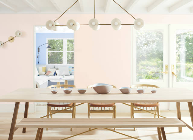
Ever wonder how paint colors get their names? If you’re shopping for pink, say, you’ll find dozens of shades referencing roses, bubblegum and shells. There are some extra-evocative names like Calamine and Dead Salmon. And what about a pink called Harajuku Morning? Modern Love?
Names can sway a person, says New York designer Daun Curry. “We once had a client choose one paint color over another because the name was Peace and Happiness,” she says.
More often, we pick a shade because we like it, says color consultant Debra Kling of New York, and “the names’ associations serve to augment our feelings about the hues.”
She warns clients that paints when applied can look very different from their names: Creams, especially, easily veer into yellow territory, even when there’s no hint of that hue in their name.
Natalie Ebel, co-founder of the direct-to-consumer paint company Backdrop — which is behind Harajuku Morning and Modern Love — says that choosing the right names for paint colors is essential.
The backstories
Farrow & Ball’s color consultant Joa Studholme shares the backstories on two pink shades, Calamine and Dead Salmon:
“For many people of a certain age, Calamine lotion was an intrinsic part of early life. Applied to treat scraped knees, stings and the general travails of a lively childhood, it was always of comfort. And what was more calming, the actual lotion or its extraordinary delicate color? It certainly creates soothing rooms in the modern world,” she says.
As for the fishy one, the name was found on a decorator’s invoice dated 1805 for a library. “Salmon is the color, and Dead actually refers to the matte paint finish,” Studholme says.
HGTV Home by Sherwin- Williams’ color of the year is Romance, another gentle pink with a name that stirs feelings.
Ebel says pinks have been the most fun to name.
“I wanted to keep the colors and names approachable for people like me — I wasn’t a huge pink person before Backdrop,” she says.
“Harajuku Morning was inspired by a trip we took to Tokyo in 2016. The color is bright, airy and fun, and reminded us of the playfulness of Takeshita Street, but in the morning before the crowds. Modern Love was inspired by one of my favorite New York Times columns — the color makes me think of the beautiful, messy feelings that come with relationships,” she says.
Just like the beautiful, messy relationship we all have with the brushes, rollers and paint colors we bring home.
Copyright ©2026— Trib Total Media, LLC (TribLIVE.com)
