Since Cracker Barrel cleaned up its logo a week ago, it has been dressed down by those averse to the change.
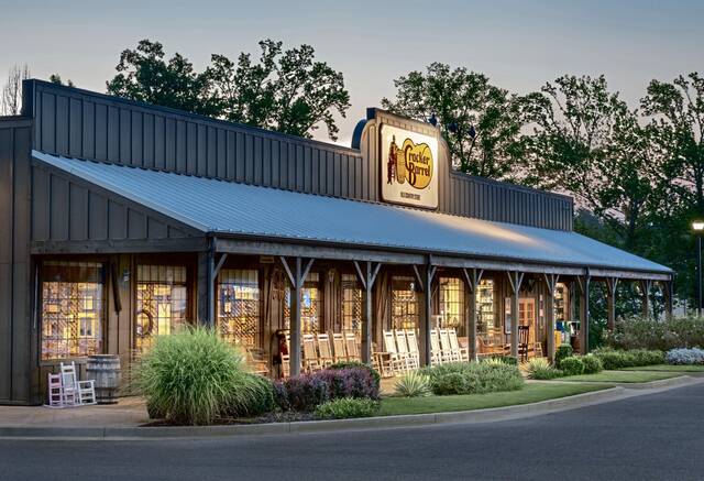
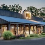
The restaurant and gift shop, a staple of roadside rest stops throughout the homeland, prides itself on a homey atmosphere that’s emblematic of an episode of “The Waltons.” Locally, there are locations in Cranberry, North Fayette, New Stanton and South Strabane.
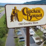
For years, the company’s logo consisted of a seated Southern gentleman leaning on a barrel.
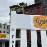
On Aug. 19, it was replaced by a clean Cracker Barrel logotype.

“Rather than just showing one person, we wanted to feature lots of people,” the Lebanon, Tenn.-based company explained in an unsigned blog post. “The idea was to celebrate the diversity of all our guests with a logo that represented our continued passion for pleasing people of all races, colors, and genders.”
That went over like a Springsteen song at a Trump rally.
U.S. Sen. Marsha Blackburn, a Republican from Tennessee, jokingly co-opted the old logo for her gubernatorial campaign.
While @CrackerBarrel sorts out its marketing crisis, we made sure the old logo isn’t going anywhere. pic.twitter.com/TOWtwQF2ua
— Marsha Blackburn (@VoteMarsha) August 25, 2025
Steak’n Shake proved it isn’t kissing kinfolk, trolling up this X post: “Heritage is what got Cracker Barrel this far and now the CEO just wants to scrape it all away.”
Sometimes, people want to change things just to put their own personality on things. At CB, their goal is to just delete the personality altogether. Hence, the elimination of the "old-timer" from the signage. Heritage is what got Cracker Barrel this far, and now the CEO wants to… pic.twitter.com/Aoml8ZOfuT
— Steak 'n Shake (@SteaknShake) August 21, 2025
Even Democrats disliked it: “We think the Cracker Barrel rebrand sucks too,” the party posted on X, signalling a shift to the center, perhaps.
We think the Cracker Barrel rebrand sucks too pic.twitter.com/XSzZcVQVd0
— Democrats (@TheDemocrats) August 21, 2025
The company’s stock, which trades on Nasdaq, is down nearly 11% in the wake of the move. It closed at $54.26 Monday. It was $60.72 on Aug. 18.
On Aug. 25, the company did some damage control on social media. “If the last few days have shown us anything, it’s how deeply people care about Cracker Barrel,” a Facebook post noted. “You’ve shown us that we could’ve done a better job sharing who we are and who we always will be.”
But Cracker Barrel appears to be sticking by the new logo.
“It’s definitely getting a lot of attention,” said Cassie Brkich, owner of Brkich Design Group in Beaver. “You have to grab attention where you can.”
That said, the move seemingly marked a drastic change for the chain, trading in its folksy, handcrafted aesthetic with something that could have been generated using Artificial Intelligence.
“The new logo gives you no warmth, no kind of feel,” Brkich said.
The previous logo was among the creations of Nashville commercial artist Bill Holley, who died in 2021. According to Holley’s widow, the logo was based on Uncle Herschel, whose namesake breakfast at Cracker Barrel is in league with Denny’s Grand Slam staple.
Brkich’s firm works with accounts smaller than Cracker Barrel, but faces the same challenges, she said. It’s created logos and branding for the city of Beaver Falls, the Jewish Federation of Southern New Jersey and Sweetwater Bikes.
She’s worked with the new owners of the Beaver Super — an independent, small-town grocery store that has a decades-long history but it also starting a new chapter. Its branding, which features a vintage, cartoonish beaver, is more in line with Cracker Barrel’s old logo.
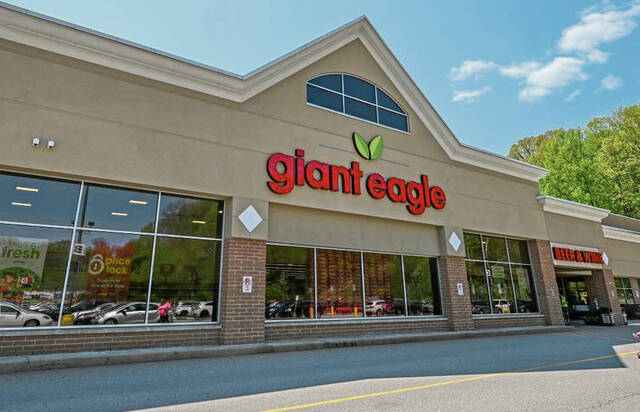
Giant Eagle, the Cranberry-based grocery store chain, last changed its logo in 2020, something that sparked some social media backlash at the time. The company declined to comment for this story.
Cracker Barrel’s move comes while the company is in a battle for relevance amid a food industry struggling to regain its footing since the covid pandemic.
Cracker Barrel CEO Julie Felss Masino, who took charge of the company last year, warned that changes were coming in a message to stockholders in June 2024.
It’s easy to second-guess a rebranding. Sometimes, they’re necessary, said Melanie Querry, owner of the Downtown-based advertising firm Beyond Spots & Dots.
When a company changes leadership, the new regime often opts for new branding.
“That is a little dangerous,” Querry said.
Beyond Spots & Dots has worked with companies and institutions across the country, including rebrands of two of the region’s universities.
Slippery Rock University was once Slippery Rock Teacher’s College, something it took decades to shed, Querry said.
The firm also worked with Indiana University of Pennsylvania to help the school shed its “Animal House”-esque image.
But backlash from such changes can still lead to better sales and increased revenue, she said, referencing Pittsburgh-based American Eagle outfitters and its Sydney Sweeney-led jeans campaign.
The ad touted Sweeney’s jeans, playing on the genes she shows off in screen credits that include “Euphoria,” “The White Lotus” and “The Handmaid’s Tale.”
Despite backlash, the campaign boosted sales for the company.
“In my experience, it’s our job to help the client see pros and cons for all of it,” Querry said. “Once you actually create it, testing it is critical.”
That said, these changes are sometimes seemingly rolled out untested, she said.
Cracker Barrel’s new logo was created in-house, according to a report in the art and design magazine Dezeen.
“When you have an established brand there’s something to be said for it, to just flip it upside down is risky,” Querry said.